Reports you can explore,
not just read.
Hover any chart to see exact values. Zoom into a date range. Filter by category. The report is the analysis tool, not just a snapshot.
What you get in every chart
Every chart in every report is built with Plotly — the same interactive plotting library used in scientific publishing and enterprise dashboards. Nothing is a screenshot.
Hover for exact values
Move over any data point and the tooltip shows the precise number, label, and any contextual fields. No squinting at axes, no guessing.
Zoom and pan
Click-and-drag to zoom into a region. Double-click to reset. Especially useful for time series and scatter plots with many points.
Filter by category
Click a legend entry to toggle a category on or off. Compare just two segments without re-running the analysis.
See it on a real report
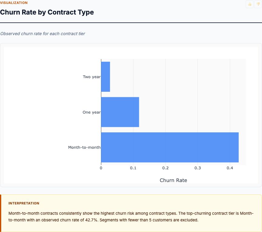
Here's a preview from a customer churn analysis we built today. Open the live report and hover any chart — every interaction works in your browser, no plugins required.
vs static dashboards
Most analytics tools generate a fixed PNG or PDF. Refresh the data, re-export the file, email it again. We do not work that way.
| Capability | Static dashboard / PDF | MCP Analytics report |
|---|---|---|
| Hover for exact values | ✗ | ✓ Every point |
| Zoom into a region | ✗ | ✓ Click-and-drag |
| Filter by category | ✗ | ✓ Toggle in the legend |
| Underlying data table | ✗ Separate file | ✓ Per-card data table in the report |
| Update when data changes | Re-export, re-email | ✓ Re-run the analysis, link is the same |
| Source code attached | ✗ | ✓ R appendix in every report |
How it ships in your report
Each report has 6-8 cards. Every card has a chart, a written interpretation with actual numbers, and a data table you can sort or filter.
Plotly JS embedded
The interactive charts work in any modern browser. No external services, no plugins to install, no JavaScript libraries you have to load yourself.
Sortable data tables
Every chart is backed by a data table you can sort, search, and copy from. The table is the same data the chart was built from — no discrepancies.
Per-card insights
Every card has a written interpretation with the actual numbers from the analysis. AI generates the prose, R generates the numbers — best of both.
Try an interactive report
Upload a CSV, get a real report with hover-able charts and a sortable data table. Free, no signup required.
Analyze your CSV →