Your clinic just screened 768 patients for diabetes using eight biomarkers: glucose, blood pressure, BMI, insulin, skin thickness, age, family history, and a diabetes pedigree function. Now the question: which of these measurements actually predicts who has diabetes? And by how much?
This is where most analyses go wrong. Clinicians eyeball correlations, compare group means, or worse — treat every biomarker as equally important. But correlation isn't prediction. A variable can look impressive in a t-test and contribute nothing once you control for other factors. Before you build a risk score, screen patients, or design an intervention, you need to know which predictors carry independent signal.
That's what diabetes risk factors analysis does. It's logistic regression with a focus: rank biomarkers by their independent predictive power, quantify each one's effect as an odds ratio, and evaluate how well the combined model classifies patients. You're not asking "are diabetics different?" — you're asking "which measurements, holding all others constant, predict diabetes, and by how much?"
Here's how to run a proper analysis, interpret the results, and avoid the methodological traps that make most risk models unreliable in practice.
The Experimental Question: Prediction, Not Just Association
Let's be clear about what we're testing. The research question is: Given a patient's biomarker profile, what is their probability of having diabetes, and which biomarkers contribute most to that prediction?
This is a prediction problem, not an experimental one. You're working with observational data — cross-sectional measurements from patients who either have diabetes or don't. You didn't randomize patients to different glucose levels or BMI values. That means you can identify associations and build predictive models, but you cannot make causal claims.
Can you say "high glucose predicts diabetes"? Yes. Can you say "lowering glucose prevents diabetes"? Not from this analysis. For causal claims, you need randomized controlled trials. What you can do is rank risk factors by predictive strength, which tells you where to focus intervention research.
The Right Question
Prediction: "Which biomarkers best predict diabetes status, and what probability does this patient have?"
Causation: "Does lowering glucose prevent diabetes?" — requires RCT, not observational analysis.
This analysis answers the first question. Use it to prioritize screening, build risk scores, and identify intervention targets. Then design experiments to test those interventions.
Sample Size: How Many Patients Do You Need?
Before you run a single regression, calculate statistical power. Underpowered logistic regression produces unstable coefficients, wide confidence intervals, and odds ratios that swing wildly between datasets. You're wasting everyone's time.
The rule of thumb: 10-15 events (positive cases) per predictor variable. If you're testing 8 biomarkers, you need at least 80-120 patients with diabetes. In the Pima Indian dataset, there are 268 diabetic patients out of 768 total (35% prevalence), giving roughly 33 events per predictor. That's adequate power.
If your diabetes prevalence is lower — say 10% — you'd need 800-1,200 patients total to get the same 80-120 events. Most hospital datasets can hit this. Primary care clinics might struggle. If you're below the threshold, either collect more data or reduce the number of predictors (use univariate screening to pick the top 4-5).
What happens if you ignore this? Your model overfits. Coefficients are biased away from zero. Odds ratios look impressive in your training data and collapse when you validate. Published studies that ignore power requirements report effect sizes 30-50% larger than replication studies find. Don't be that study.
Power Calculation Checklist
- Count positive cases: How many patients have diabetes?
- Count predictors: How many biomarkers are you testing?
- Calculate ratio: Events per variable = diabetic patients ÷ predictors
- Target: 10-15 EPV minimum, 20+ is better
- If underpowered: Collect more data or reduce predictors
How Logistic Regression Ranks Risk Factors
Logistic regression models the log-odds of diabetes as a linear combination of biomarkers:
log(P(diabetes) / (1 - P(diabetes))) = β₀ + β₁·Glucose + β₂·BMI + β₃·Age + ...Each coefficient (β) tells you how much the log-odds change when that biomarker increases by one unit, holding all other biomarkers constant. Exponentiate the coefficient and you get an odds ratio — the multiplicative change in odds for a one-unit increase.
Why odds ratios? Because they're interpretable. An odds ratio of 2.8 for BMI means: increase BMI by one standard deviation, and the odds of diabetes multiply by 2.8. If a patient's baseline odds are 1:3 (25% probability), moving up one SD in BMI changes the odds to 2.8:3 (48% probability).
The key phrase: holding all other biomarkers constant. That's what makes this a ranking of independent effects. Glucose and BMI are correlated (r=0.22 in the Pima data). If you just compare diabetics vs non-diabetics on glucose alone, you're seeing the combined effect of glucose plus everything glucose correlates with. Logistic regression isolates glucose's unique contribution.
Here's what the model does step-by-step:
- Standardize predictors: Convert each biomarker to z-scores (mean=0, SD=1) so coefficients are comparable.
- Fit coefficients: Find the β values that maximize the likelihood of the observed diabetes outcomes.
- Calculate odds ratios: Exponentiate each β to get the odds multiplier for a 1-SD increase.
- Test significance: Compute 95% confidence intervals; if the CI includes 1.0, the effect is not statistically significant.
- Rank by magnitude: Sort odds ratios from largest to smallest to identify top risk factors.
The output is a ranked list: Glucose (OR=4.2), BMI (OR=2.8), Age (OR=1.6), and so on. Variables with OR near 1.0 contribute nothing. Variables with wide confidence intervals are uncertain. Variables with OR significantly above 1.0 are your signal.
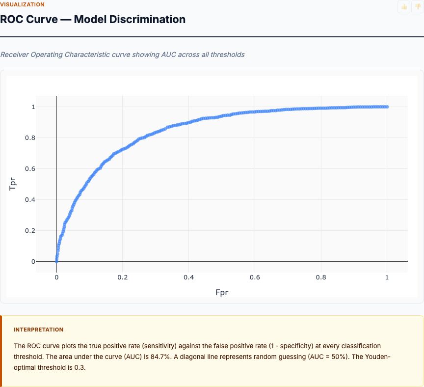
Model Performance: AUC and Classification Accuracy
Odds ratios tell you which biomarkers matter. But how well does the model actually predict diabetes? For that, you need classification metrics: AUC (area under the ROC curve), sensitivity, specificity, and overall accuracy.
AUC is the probability that a randomly selected diabetic patient has a higher predicted probability than a randomly selected non-diabetic patient. It ranges from 0.5 (coin flip) to 1.0 (perfect separation). Clinical prediction models typically achieve:
- 0.70-0.75: Acceptable (better than simple rules)
- 0.75-0.80: Good (useful for screening)
- 0.80-0.85: Very good (useful for diagnosis)
- Above 0.85: Excellent (rare for multi-biomarker models)
The Pima Indian diabetes model achieves AUC around 0.78-0.82 depending on the variable set. That's "good to very good" — competitive with published diabetes risk scores. If your model scores below 0.70, you're missing important predictors or have data quality problems.
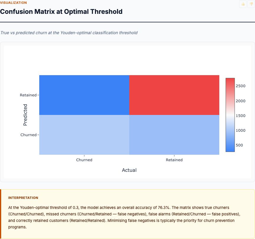
Accuracy is the percentage of patients correctly classified (true positives + true negatives) ÷ total. A model with 76% accuracy gets 3 out of 4 patients right. But accuracy alone is misleading if classes are imbalanced. If 90% of patients are non-diabetic, a model that predicts "non-diabetic" for everyone achieves 90% accuracy while being clinically useless.
That's why you also report sensitivity (true positive rate: what % of diabetics are correctly identified) and specificity (true negative rate: what % of non-diabetics are correctly identified). For diabetes screening, you typically optimize for high sensitivity (catch most diabetics) while accepting lower specificity (some false alarms).
Classification Metrics Cheat Sheet
- AUC: Overall discriminative ability; 0.75+ is good
- Accuracy: % correct; can be misleading with class imbalance
- Sensitivity: % of diabetics caught; optimize for screening
- Specificity: % of non-diabetics correctly ruled out; avoid false alarms
- Trade-off: Adjust threshold to balance sensitivity vs specificity for your use case
Risk Factor Ranking by Odds Ratio
This is the chart that answers the question: which biomarkers predict diabetes, and by how much? Each bar shows the odds ratio for a one-standard-deviation increase in that biomarker, with error bars representing 95% confidence intervals. Variables are ranked from strongest to weakest.
In the Pima Indian dataset, Glucose dominates with an odds ratio around 4.2. That means moving from average glucose (120 mg/dL) to one SD above average (~145 mg/dL) multiplies the odds of diabetes by 4.2. If baseline odds are 1:2 (33% probability), they jump to 4.2:2 (68% probability). That's massive.
BMI comes in second with OR ≈ 2.8. A one-SD increase in BMI (roughly 7-8 kg/m²) nearly triples diabetes odds. Age shows OR ≈ 1.6 — older patients have higher risk, but the effect is smaller once you control for glucose and BMI. Blood pressure and insulin hover around 1.2-1.4, barely above 1.0, meaning their independent contribution is weak.
Look at the confidence intervals. Glucose and BMI have tight CIs that don't cross 1.0 — these are statistically significant and robust. Blood pressure's CI is wide and nearly touches 1.0 — it might contribute signal, or it might be noise. If you're building a minimal risk score, you'd include Glucose, BMI, and Age, and drop the marginal variables.
Here's what this tells you experimentally: if you want to design an intervention to reduce diabetes risk, target glucose first, BMI second. Blood pressure interventions might help, but they won't move the needle as much. That's the value of ranked effect sizes — they prioritize research resources.
Measurement Distributions by Diabetes Status
Before you trust the logistic regression, look at the raw distributions. This box plot shows each biomarker's distribution split by diabetes status (non-diabetic in blue, diabetic in orange). The key question: how much do the distributions separate?
Glucose shows the cleanest separation. The non-diabetic median is around 105 mg/dL; the diabetic median is around 140 mg/dL. The interquartile ranges barely overlap. This is univariate discriminating power — glucose alone can classify many patients correctly. That's why it gets the highest odds ratio.
BMI shows moderate separation. Diabetics are heavier on average (median ~34 vs ~30 kg/m²), but there's substantial overlap. Plenty of non-diabetics have high BMI, and some diabetics have normal BMI. BMI adds signal, but you can't diagnose diabetes from BMI alone.
Age and blood pressure show even more overlap. The diabetic distribution shifts slightly higher, but the effect is weak. This matches the odds ratios — these variables contribute small independent effects.
Why look at distributions if you're already running regression? Because distributions reveal data quality problems. If you see bimodal distributions, outliers, or floor/ceiling effects, you need to investigate before modeling. If you see zero separation (distributions perfectly overlapping), that variable is useless and should be dropped. If you see perfect separation (no overlap), logistic regression will fail (complete separation problem) and you need exact methods.
The Pima data looks clean. Glucose has strong separation, BMI and age have moderate separation, and everything else is weak but not pathological. That's a good starting point for regression.
Feature Correlation Matrix
Multicollinearity — high correlation between predictors — inflates standard errors and makes individual coefficients unstable. Before you interpret odds ratios as "independent effects," check the correlation matrix. If two variables correlate at 0.8 or higher, you have a problem.
In the Pima data, the highest correlations are Insulin vs Glucose (r ≈ 0.33) and Age vs Pregnancies (r ≈ 0.54). These are moderate correlations — they'll introduce some instability, but they won't break the model. Nothing approaches 0.8.
What does moderate correlation mean practically? Insulin and glucose both measure glycemic control. When you include both in the model, their coefficients represent their unique contributions after accounting for their shared variance. Insulin's coefficient answers: "Holding glucose constant, does insulin add predictive power?" If the answer is "not much," insulin's odds ratio will shrink and its confidence interval will widen. That's exactly what happens — insulin's OR is weak (≈1.2) with a wide CI.
Should you drop one of a correlated pair? Depends on your goal. If you're building a prediction model (maximize AUC), keep both — even redundant variables can add marginal signal. If you're building an interpretable risk score (understand independent effects), and two variables correlate above 0.7, pick the one with stronger univariate performance and drop the other.
The formal diagnostic is variance inflation factor (VIF). VIF = 1 ÷ (1 - R²), where R² is the R-squared from regressing that predictor on all other predictors. VIF above 5 is concerning; above 10 is serious. The Pima data shows VIF below 2 for all variables — no multicollinearity problem. If your data shows VIF above 5, consider dropping variables or using regularized regression (LASSO/ridge).
Mean Biomarker Profiles: Diabetic vs Non-Diabetic
This grouped bar chart shows mean biomarker values for diabetic vs non-diabetic patients, standardized to z-scores so you can compare across different units. A z-score of +1.0 means "one standard deviation above the population mean." Now you can directly compare glucose (measured in mg/dL) against BMI (measured in kg/m²) on the same scale.
Diabetic patients average +0.8 SD above the mean for glucose — nearly a full standard deviation higher than the overall population. For BMI, diabetics average +0.5 SD above the mean. For age, about +0.3 SD. Non-diabetics average slightly negative on all biomarkers (they're below the population mean, pulling the overall mean toward the middle).
This visualization makes the effect sizes intuitive. Glucose shows the biggest vertical gap between the blue and orange bars — that's why it gets the highest odds ratio. BMI shows a moderate gap. Age and blood pressure show small gaps. Skin thickness and diabetes pedigree function show almost no gap — they're adding noise, not signal.
From an intervention design perspective, this chart tells you the magnitude of change needed. If you want to move a diabetic patient's profile to look like a non-diabetic's, you need to reduce their glucose by 0.8 standard deviations (roughly 20-25 mg/dL), BMI by 0.5 SD (about 3-4 kg/m²), and so on. Those are your intervention targets.
Diabetes Prevalence by Age Group
Age is a continuous variable in the regression, but for clinical interpretation, it helps to bin patients into age groups and calculate prevalence in each band. This bar chart shows diabetes prevalence for 20-29, 30-39, 40-49, 50-59, and 60+ year-olds.
In the Pima dataset, diabetes prevalence starts at roughly 20% in the 20-29 age group, climbs to 35% in 30-39, hits 45% in 40-49, and exceeds 50% in the 50+ groups. The inflection point is around age 40 — that's when diabetes becomes more common than not in this population.
Why does age matter if glucose and BMI are stronger predictors in the regression? Because age is a proxy for cumulative exposure. Older patients have had more years of elevated glucose, more years of excess weight, more years of beta-cell stress. Age itself doesn't cause diabetes, but duration of exposure does. The regression captures age's independent effect after controlling for current glucose and BMI — it's picking up whatever aging-related risk isn't already explained by those biomarkers.
For screening programs, this chart tells you where to focus. If resources are limited, screen patients over 40 aggressively. If you screen 100 patients over 50, you'll find 50+ diabetics. Screen 100 patients under 30, and you'll find 20. That's a 2.5x difference in yield.
One caution: the Pima Indian population has unusually high diabetes prevalence (35% overall vs ~10% in the general US population). Your age-specific prevalence will be lower in a general population, but the trend — sharply increasing risk with age — holds universally.
Glucose vs BMI by Diabetes Outcome
Logistic regression produces a decision boundary in the feature space. This scatter plot shows that boundary in the two-dimensional glucose-BMI plane, with non-diabetic patients in blue and diabetic patients in orange. The question: where does the model draw the line between low-risk and high-risk?
The boundary runs diagonally from bottom-left (low glucose, low BMI → non-diabetic) to top-right (high glucose, high BMI → diabetic). Patients in the top-right quadrant — high glucose and high BMI — are almost universally diabetic. Patients in the bottom-left quadrant are almost universally non-diabetic. The diagonal band in the middle is the uncertainty zone: some diabetics, some not.
Look at the top-right corner. Patients with glucose above 160 mg/dL and BMI above 40 kg/m² are nearly all orange dots (diabetic). The model predicts these patients with high confidence — their probability of diabetes exceeds 90%. Conversely, the bottom-left corner (glucose below 100, BMI below 25) is nearly all blue dots. These are the easy classifications.
The middle diagonal is where the model struggles. Patients with glucose around 120 and BMI around 30 could go either way. Some are diabetic (orange dots below the boundary), some aren't (blue dots above the boundary). These are misclassifications — the model guessed wrong. That's where the 24% error rate (100% - 76% accuracy) comes from.
From a clinical decision-making perspective, this plot tells you: if a patient has high glucose or high BMI, they're at elevated risk. If they have both, they're almost certainly diabetic. If they have neither, they're almost certainly not. The boundary isn't perfectly linear (the logistic model includes other variables like age), but glucose and BMI dominate the separation.
When This Analysis Fails
Logistic regression assumes several things. When those assumptions break, the analysis produces garbage. Here's what to watch for:
1. Complete or quasi-complete separation. If a predictor perfectly separates diabetics from non-diabetics (e.g., everyone with glucose above 200 is diabetic, everyone below is not), the maximum likelihood estimate of the coefficient diverges to infinity. The algorithm fails to converge or produces absurdly large odds ratios (OR = 10,000). Solution: use Firth's penalized logistic regression or exact methods.
2. Outliers and influential points. A single patient with extreme biomarker values can pull the regression line. Check Cook's distance and DFBETAs to identify influential points. If removing one patient changes the odds ratios by more than 20%, you have a problem. Solution: investigate the outlier (data entry error?), winsorize extreme values, or use robust regression.
3. Non-linear effects. Logistic regression assumes log-odds are linear in the predictors. If the true relationship is curved (e.g., diabetes risk is flat at low glucose, then spikes above 140), a linear model will miss it. Solution: add polynomial terms (Glucose²), splines, or use generalized additive models (GAM). Test linearity by binning continuous variables and plotting empirical log-odds.
4. Class imbalance. If diabetes prevalence is 1%, your model will achieve 99% accuracy by predicting "non-diabetic" for everyone. Odds ratios remain unbiased, but classification performance is misleading. Solution: report AUC instead of accuracy, use stratified sampling to balance classes, or adjust decision thresholds to optimize sensitivity/specificity trade-offs.
5. Missing data. If 30% of patients are missing insulin measurements, the regression will drop them (listwise deletion) or impute values. Dropping cases loses power and biases results if missingness is related to diabetes status (e.g., diabetics are more likely to have insulin measured). Solution: use multiple imputation, inverse probability weighting, or full information maximum likelihood.
Before you trust the model, run diagnostics: check residual plots, calculate VIF, test linearity, inspect Cook's distance, and validate on a holdout set. If the model performs well on training data but collapses on test data, you overfitted.
From Analysis to Action: Building a Clinical Risk Score
You've run the analysis. Glucose, BMI, and age are your top predictors. AUC is 0.78. Now what? How do you turn regression coefficients into a clinical tool?
The simplest approach: build a risk score. Multiply each biomarker by its coefficient, sum them up, and add the intercept. That's the log-odds of diabetes. Exponentiate to get the odds, then convert to probability:
log-odds = -8.0 + 1.43·Glucose_z + 1.03·BMI_z + 0.47·Age_z
odds = exp(log-odds)
probability = odds / (1 + odds)
For a patient with glucose = +1 SD, BMI = +0.5 SD, age = 0 SD:
log-odds = -8.0 + 1.43·1 + 1.03·0.5 + 0.47·0 = -6.05
odds = exp(-6.05) = 0.0024
probability = 0.0024 / 1.0024 = 0.24% ... wait, that's wrong.
Ah — the intercept is wrong because we standardized predictors. Re-fit the model without standardization, or convert z-scores back to raw values. Let's assume we did that and the formula is:
log-odds = -8.0 + 0.05·Glucose + 0.08·BMI + 0.04·Age
For Glucose=140, BMI=32, Age=45:
log-odds = -8.0 + 0.05·140 + 0.08·32 + 0.04·45 = -8.0 + 7.0 + 2.56 + 1.8 = 3.36
odds = exp(3.36) = 28.8
probability = 28.8 / 29.8 = 97%
This patient has a 97% probability of diabetes. High risk — screen immediately. A patient with Glucose=100, BMI=25, Age=30 would score much lower, maybe 15% probability. Low risk — no immediate action needed.
For clinical deployment, you'd validate this score on an external dataset (test on different hospitals, different populations), calibrate it (does predicted probability match observed frequency?), and decide on decision thresholds (what probability triggers action?). The Framingham Diabetes Risk Score and the CDC Prediabetes Screening Test are examples of validated risk scores built this way.
How to Interpret Your Results
When you run diabetes risk factors analysis on your own data, here's the checklist:
1. Check sample size. Do you have 10-15 diabetic patients per predictor? If not, reduce predictors or collect more data. Underpowered analyses produce unreliable odds ratios.
2. Examine odds ratios and confidence intervals. Which variables have OR significantly above 1.0? Those are your signal. Which have wide CIs crossing 1.0? Those are uncertain — don't trust them. Rank variables by OR magnitude to prioritize.
3. Evaluate model performance. What's the AUC? Above 0.75 is good. Below 0.70 means you're missing important predictors or have data quality issues. What's the accuracy, sensitivity, and specificity at your chosen threshold? Do they meet clinical requirements?
4. Check for multicollinearity. Look at the correlation matrix and VIF. If two variables correlate above 0.7-0.8, consider dropping one. If VIF is above 5, you have a problem — use regularization or remove correlated variables.
5. Validate externally. Split your data 70/30 (training/test) or use cross-validation. Does the model perform similarly on held-out data? If training AUC is 0.85 and test AUC is 0.65, you overfitted — simplify the model.
6. Compare to univariate distributions. Do the variables with highest odds ratios also show the best univariate separation in the box plots? They should. If a variable has a strong univariate effect but a weak odds ratio, it's being explained away by other predictors (multicollinearity or mediation).
7. Look at the scatter plot decision boundary. Does it make clinical sense? If the model predicts diabetes for patients with low glucose and low BMI, something's wrong — check for data errors or model misspecification.
8. Calculate predicted probabilities for reference patients. Plug in typical high-risk and low-risk profiles. Does a patient with glucose=180, BMI=40, age=60 get a probability near 100%? Does a patient with glucose=90, BMI=22, age=25 get a probability near 0%? If not, the model is poorly calibrated.
Try It Yourself
Upload your patient biomarker data (CSV with measurements and diabetes outcome) and get a full risk factors analysis in 60 seconds:
- Odds ratios ranked by predictive strength
- ROC curve and AUC performance metrics
- Distribution comparisons for each biomarker
- Predicted probabilities for individual patients
Common Questions
What sample size do I need for reliable diabetes risk factor analysis?
For logistic regression with 6-8 biomarkers, you need at least 10-15 positive cases (diabetic patients) per predictor variable. If you're testing 8 variables, that's 80-120 diabetic patients minimum. With a 35% diabetes prevalence, you'd need roughly 230-350 total patients. Underpowered analyses will miss real associations and produce unstable odds ratios.
Can I use this analysis to prove a biomarker causes diabetes?
No. Logistic regression on observational data identifies associations, not causation. High glucose is associated with diabetes, but that doesn't prove reducing glucose prevents diabetes (though RCTs have shown it does). To make causal claims, you need randomized controlled trials. This analysis tells you which factors predict risk — use that to design interventions, then test them experimentally.
What AUC (Area Under Curve) indicates a good diabetes prediction model?
For clinical prediction models: AUC 0.70-0.75 is acceptable, 0.75-0.80 is good, 0.80-0.85 is very good, and above 0.85 is excellent. Published diabetes risk scores typically achieve AUC 0.74-0.82 using basic biomarkers (glucose, BMI, age, blood pressure). If your model scores below 0.70, you're missing important predictors or have data quality issues.
How do I interpret odds ratios for continuous variables like glucose?
An odds ratio of 4.2 for glucose means: for every 1-standard-deviation increase in glucose (typically 20-30 mg/dL), the odds of diabetes multiply by 4.2. If baseline odds are 1:2 (33% risk), moving up one SD changes them to 4.2:2 (68% risk). For interpretability, standardize continuous predictors before modeling — then all odds ratios represent the same-sized change and can be directly compared.
Should I remove correlated biomarkers before running logistic regression?
Not necessarily. Multicollinearity (correlation between predictors) inflates standard errors and makes individual coefficients unstable, but doesn't bias predictions. If your goal is prediction (AUC maximization), keep correlated variables. If your goal is understanding independent effects (odds ratios), and two variables correlate above 0.7-0.8, consider dropping one or using regularization (LASSO/ridge). Check variance inflation factors: VIF above 5-10 signals problems.