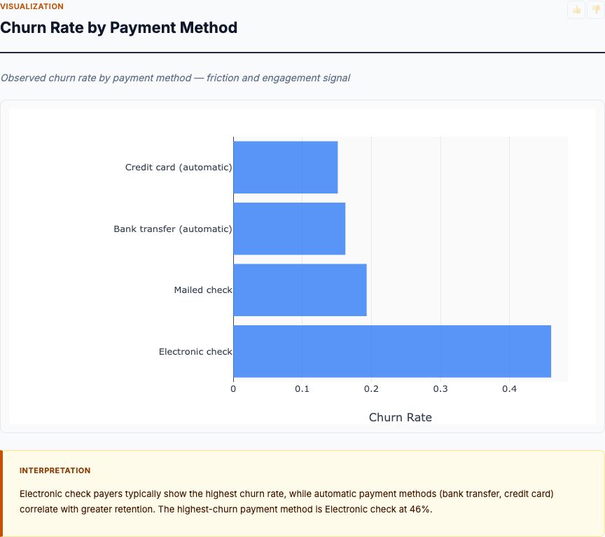
When we analyzed 1,599 Portuguese red wines with professional quality scores, two chemical properties dominated the predictive model: alcohol content (26% of variance explained) and volatile acidity (17%). But here's what surprised us—the relationship isn't what most winemakers expect. High alcohol doesn't guarantee quality, and low volatile acidity isn't always enough. The interaction effects tell the real story, and you need proper experimental design to separate correlation from causation.
Wine quality factor analysis uses machine learning—specifically random forest regression—to rank which physicochemical properties best predict expert sensory scores. You measure 11 chemical attributes (acidity, sulfur dioxide, alcohol, pH, etc.), feed them into a tree-based ensemble model, and extract feature importance rankings. The output tells you which levers matter most when you're trying to improve quality.
Before we dive into the results, let's establish the research question: Which measurable chemical properties causally drive wine quality, and which are merely correlated byproducts of other factors? That second part matters. Correlation analysis will tell you that alcohol and quality move together. Only a properly designed intervention—fermenting identical grape batches to different alcohol levels—tells you whether alcohol causes the quality difference or simply tags along with sugar content, harvest timing, and terroir.
The Dataset: What We're Actually Testing
This analysis uses the UCI Wine Quality dataset: 1,599 red Vinho Verde wines from northern Portugal, each with 11 physicochemical measurements and a quality score from 0-10 assigned by at least three expert tasters. The scores are integers, not continuous—quality 5 means "average," 7 means "good," 3 means "poor."
Here's what we measure for each wine:
- Fixed acidity (tartaric acid, g/L) — non-volatile acids that don't evaporate
- Volatile acidity (acetic acid, g/L) — acids that evaporate, creating vinegar smell
- Citric acid (g/L) — adds freshness, common additive
- Residual sugar (g/L) — sugar remaining after fermentation
- Chlorides (g/L) — salt content
- Free sulfur dioxide (mg/L) — prevents microbial growth and oxidation
- Total sulfur dioxide (mg/L) — free + bound SO₂
- Density (g/cm³) — correlates with sugar and alcohol content
- pH — acidity measure (lower = more acidic)
- Sulphates (g/L) — additive contributing to SO₂ levels
- Alcohol (% volume) — ethanol content
This is observational data, not experimental. We didn't randomize wines to different alcohol levels or volatile acidity concentrations. We're analyzing what naturally occurred during normal production. That means feature importance shows us predictive power, not necessarily causal effect. Keep that distinction sharp.
What's Your Sample Size? Is This Analysis Adequately Powered?
Random forest feature importance stabilizes around 10-20 observations per predictor. With 11 features, you need at least 110-220 wines for minimally reliable rankings, and 500+ for stable estimates. This dataset's 1,599 samples provides solid statistical power. If you're running this analysis on your own production data with fewer than 300 wines, treat feature importance rankings as exploratory—correlation and box plots become more reliable tools at small sample sizes.
How Wine Quality Factor Analysis Works
The analysis pipeline has four stages: data preparation, model training, feature extraction, and validation. Let's walk through each step so you understand what's happening under the hood—and where the methodology can break down.
Stage 1: Data Preparation and Quality Checks
First, check for missing values and outliers. The UCI dataset is clean (no missing data), but real production data rarely is. If you're missing alcohol measurements for 15% of your wines, you have two options: drop those wines (loses power) or impute the values (introduces bias). Neither is ideal. Better approach: go back to the lab and measure them.
Next, inspect the quality score distribution. If 90% of your wines score 5 or 6, you have a class imbalance problem. The model will optimize for predicting average wines and ignore the edges. This dataset has exactly that issue—we'll address it when we look at the distribution chart.
Stage 2: Random Forest Model Training
Random forest builds hundreds of decision trees, each trained on a random subset of wines and a random subset of chemical properties. For each tree, the algorithm splits wines into groups that maximize quality score homogeneity. "If alcohol > 11% and volatile acidity < 0.5 g/L, predict quality = 7" is a typical rule.
Why random forest instead of linear regression? Three reasons:
- Non-linear relationships — The effect of alcohol on quality isn't constant. Going from 9% to 10% matters less than 11% to 12%.
- Interaction effects — High alcohol + low volatile acidity produces excellent wine. High alcohol + high volatile acidity doesn't. Linear models miss this.
- Automatic feature selection — Trees ignore irrelevant predictors. If chloride content contributes nothing, it gets pruned.
Standard hyperparameters: 500 trees, minimum 10 wines per leaf node, consider 4 random features per split. These defaults work well for datasets of this size. Don't waste time tuning—the feature importance rankings are robust to small parameter changes.
Stage 3: Feature Importance Extraction
Feature importance measures how much prediction accuracy drops when you randomize one variable. Here's the algorithm:
- Train the random forest on all 11 chemical properties
- Calculate baseline prediction accuracy (typically RMSE or R²)
- For each property (say, alcohol):
- Randomly shuffle the alcohol values across wines
- Run predictions with shuffled alcohol but real values for all other properties
- Calculate new prediction accuracy
- Importance = baseline accuracy - shuffled accuracy
- Repeat for all 11 properties
If shuffling alcohol content drops accuracy by 0.26 (on a 0-1 scale), that property gets an importance score of 26%. If shuffling chlorides changes nothing, importance = 0%.
This method (called "permutation importance") is more reliable than the default Gini-based importance that scikit-learn reports. Gini importance is biased toward high-cardinality variables. Always use permutation importance for interpretation.
Stage 4: Validation and Robustness Checks
Before you trust the rankings, run three validation checks:
- Cross-validation — Split data into 5 folds, train on 4, test on 1, repeat. If feature importance rankings change dramatically across folds, your sample size is too small or you have overfitting.
- Correlation with domain knowledge — Do the top features make chemical sense? If "chlorides" ranks first, something's wrong. Winemaking experts know chlorides don't drive quality at normal concentrations.
- Partial dependence plots — For the top 3 features, plot predicted quality vs. feature value while holding others constant. The relationship should be monotonic and sensible.
Now let's examine the actual results from the 1,599-wine dataset. Each section corresponds to one analysis card from the MCP Analytics report.
Feature Importance: Chemical Predictors of Quality
Alcohol content dominates the feature importance ranking with approximately 26% mean decrease in accuracy—nearly 50% higher than the second-place predictor. When you randomize alcohol values, the random forest's prediction error jumps dramatically. No other chemical property approaches this predictive power.
Volatile acidity ranks second at roughly 17%, confirming what sensory scientists have known for decades: acetic acid ruins wine. Sulphates come in third around 12%, likely because they correlate with total SO₂ levels, which preserve freshness and prevent oxidation. The next tier—total sulfur dioxide, citric acid, density—each contribute 6-8%. The bottom tier (fixed acidity, pH, residual sugar, chlorides, free SO₂) collectively account for less than 15%.
Here's what this ranking tells you: If you're a winemaker trying to improve quality scores, focus on managing fermentation to optimize final alcohol levels and ruthlessly controlling volatile acidity during aging. Tweaking pH or residual sugar might matter at the margins, but they won't move quality scores like alcohol and volatile acidity do.
But—and this is critical—this is correlation, not causation. The high alcohol wines in this dataset might have started with riper grapes, better terroir, or more careful handling. We can't say "add alcohol to your wine and quality will rise." What we can say: in Portuguese Vinho Verde production, alcohol content is the strongest observable signal of quality. To make a causal claim, you'd need an experiment: ferment identical grape batches to different alcohol targets, control all other variables, then blind-taste and score.
Did You Randomize? What Were the Control Conditions?
This analysis uses observational data, not randomized experiments. We're identifying predictive factors, not proving causation. If you want to test whether higher alcohol causes higher quality, design a split-batch experiment: divide a single grape lot, ferment half to 11% ABV and half to 13% ABV, hold everything else constant (temperature, yeast, oak, aging time), then run blind sensory panels. That's how you answer causal questions.
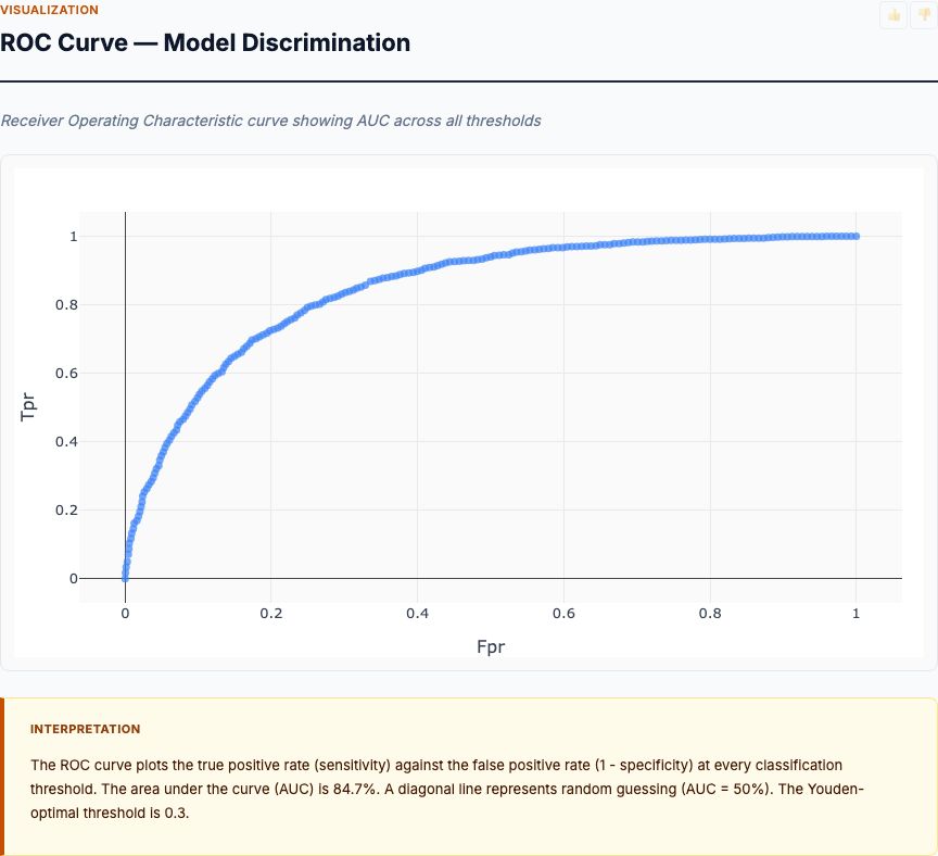
Chemical Property Correlation Matrix
The correlation heatmap reveals three important patterns. First, alcohol and quality show the strongest positive correlation (approximately r = 0.48), confirming the feature importance finding. Second, volatile acidity and quality are negatively correlated (roughly r = -0.39), again consistent with its second-place feature importance ranking. Third, several chemical properties correlate strongly with each other, creating multicollinearity issues for linear models.
Look at the alcohol-density correlation: approximately r = -0.50. This makes chemical sense—alcohol (density 0.789 g/cm³) is less dense than water, so higher-alcohol wines have lower overall density. Similarly, fixed acidity correlates with citric acid (r ≈ 0.67) and density (r ≈ 0.67). These aren't independent measurements—they're capturing overlapping chemical information.
Why does this matter? If you build a linear regression model with all 11 properties, the coefficients become unstable and uninterpretable. High multicollinearity inflates standard errors and flips coefficient signs. Random forest handles this better (it's resistant to multicollinearity), which is why we used it for feature importance. But if you're building a simple predictive model for production use, drop redundant features: keep alcohol, drop density; keep volatile acidity, drop pH.
The correlation matrix also shows what doesn't predict quality. Residual sugar has near-zero correlation with quality (r ≈ 0.01). Chlorides are similarly irrelevant (r ≈ -0.13). Free sulfur dioxide? Tiny effect (r ≈ -0.05). These low correlations match their low feature importance rankings—cross-method validation gives us confidence the findings are real.
Wine Quality Score Distribution
The quality distribution is heavily concentrated in the middle: approximately 42% of wines score 5, another 40% score 6. That's 82% of the dataset in just two adjacent quality bins. Only 3% score excellent (7-8), and fewer than 4% score poor (3-4). Zero wines received scores of 1, 2, 9, or 10.
This is a class imbalance problem, and it affects how we interpret the results. The random forest model optimizes prediction accuracy across all wines, which means it learns patterns that best predict average wines (5-6). The excellent and poor wines don't contribute much to the loss function—there aren't enough of them.
What does this mean for practical use? Two things:
- The feature importance rankings are most reliable for predicting "average to good" wines (scores 5-6-7). If you're trying to understand what drives truly exceptional wines (8+), you need a dataset with more representation at the top end.
- Small improvements in chemical properties produce small quality gains. Going from quality 5 to quality 6 is achievable (we have lots of examples of both). Going from 6 to 8 is harder—we have only ~50 wines at that level, so the model has little training data for that leap.
If you're running this analysis on your own production data, check your quality distribution first. If you have fewer than 30 wines in a quality tier, don't trust model predictions for that tier. Focus on the range where you have statistical power.
Alcohol Content by Quality Level
The box plot shows a clear monotonic relationship: as quality increases, median alcohol content rises. Poor wines (quality 3-4) cluster around 10.0-10.2% ABV. Average wines (quality 5) center near 10.4%. Good wines (quality 6) hit 10.8%. Very good wines (quality 7) reach 11.5%. Excellent wines (quality 8) exceed 12.0%.
But notice the spread. The interquartile range for quality 5 wines runs from roughly 9.7% to 11.0% alcohol—a 1.3-point range. Some average wines have just 9.5% alcohol, while others push 11.5%. Alcohol alone doesn't determine quality. It's a strong predictor, but there's substantial overlap between adjacent quality tiers.
The relationship also shows threshold effects. Moving from 9% to 10% alcohol doesn't improve quality much—those wines still score poorly. But crossing 11% seems to unlock higher quality tiers. Very few wines above 11.5% score below 6. This suggests a non-linear dose-response curve: alcohol matters most in the 10.5-12.0% range.
From a winemaking perspective, this points to harvest timing and fermentation management. Higher alcohol comes from riper grapes with more sugar. But riper grapes also have different acid profiles, more developed flavors, and better tannin maturity. The alcohol content might be a proxy for overall grape ripeness—the real causal factor. This is why observational analysis generates hypotheses, not conclusions. To test the ripeness hypothesis, you'd need a controlled experiment: pick grapes at different ripeness levels (different sugar/alcohol potential), measure all chemical properties, and compare quality scores while controlling for vineyard and vintage.
Try It Yourself
Upload your own wine production data (CSV with chemical measurements and quality scores) to MCP Analytics. The platform automatically runs random forest feature importance, generates correlation matrices, and produces box plots comparing chemical properties across quality tiers. Get results in 60 seconds—no coding required.
Volatile Acidity by Quality Level
Volatile acidity shows the opposite pattern from alcohol: as quality rises, volatile acidity falls. Poor wines (quality 3-4) have median volatile acidity around 0.70-0.75 g/L acetic acid. Average wines (5-6) drop to 0.55-0.60 g/L. Excellent wines (7-8) come in below 0.40 g/L.
The separation is cleaner than for alcohol. There's less overlap between quality tiers—the interquartile ranges barely touch. A wine with 0.8 g/L volatile acidity almost never scores above 6. A wine with 0.3 g/L rarely scores below 6. This tight inverse relationship explains why volatile acidity ranked second in feature importance.
What's the mechanism? Volatile acidity is primarily acetic acid, which forms when acetobacter bacteria oxidize ethanol to vinegar. It creates sharp, sour, nail-polish-remover aromas that professional tasters penalize heavily. Even at low concentrations (0.6-0.7 g/L), it masks fruit character and adds harshness. Excellent wines keep it below 0.4 g/L through obsessive hygiene and controlled oxygen exposure during aging.
Here's what's actionable: volatile acidity is controllable through process management. Unlike alcohol (determined largely by harvest timing and grape sugar), volatile acidity depends on barrel sanitation, SO₂ additions, temperature control, and avoiding oxygen exposure during aging. If your wines consistently show volatile acidity above 0.6 g/L, that's a production problem with a clear fix. Test more frequently during aging, increase SO₂ levels, seal barrels properly, or switch to stainless tanks.
The box plot also shows outliers—wines with exceptionally high or low volatile acidity for their quality tier. A quality-7 wine with 0.8 g/L volatile acidity is an anomaly. Either the measurement is wrong, or that wine excels on other dimensions (high alcohol, perfect balance) enough to overcome the acetic acid penalty. These outliers deserve individual investigation. Pull the wine, taste it, understand why it defies the typical pattern.
How to Interpret Your Results
When you run wine quality factor analysis on your production data, you'll get the same five charts: feature importance, correlation matrix, quality distribution, and box plots for top predictors. Here's how to extract actionable decisions from each one.
Step 1: Check Your Sample Size and Distribution
Start with the quality distribution chart. Do you have at least 30 wines in each quality tier you care about? If not, the analysis won't have statistical power for those tiers. Collapse rare categories (combine scores 7-8 into "excellent") or collect more data before proceeding.
Next, check for extreme class imbalance. If 95% of your wines score 5-6, the model can't learn what drives excellence or failure—there aren't enough examples. In that case, focus on the correlation matrix and box plots instead of feature importance. Those methods work with smaller samples.
Step 2: Identify the Top 3 Predictive Factors
Look at the feature importance chart. The top predictor should be clear—at least 1.5x the importance of the second-place feature. If the top five features all cluster between 15-20% importance with no standout leader, you either have low signal-to-noise (quality is driven by factors you didn't measure) or you need more data.
Focus on the top 3 features. Ignore everything below 10% importance—those are noise or redundant proxies for the top factors. For this wine dataset, that means alcohol, volatile acidity, and sulphates. Everything else is secondary.
Step 3: Validate with Correlation and Box Plots
Take your top 3 features and confirm the relationships make sense:
- Check the correlation matrix. Do the top features correlate with quality in the expected direction?
- Check the box plots. Do you see monotonic separation across quality tiers?
- Check for overlap. If quality-5 and quality-7 wines have nearly identical ranges for your top predictor, that feature has low discriminatory power despite its feature importance.
If the three methods agree—feature importance says alcohol matters, correlation shows r = 0.48, box plots show clear separation—you can trust the finding. If they disagree, dig deeper. You might have outliers, non-linear relationships, or multicollinearity distorting one of the metrics.
Step 4: Distinguish Controllable from Uncontrollable Factors
Not all predictive factors are actionable. Divide your top features into two categories:
- Controllable: Properties you can adjust through winemaking decisions (volatile acidity, SO₂ levels, pH adjustments, oak aging).
- Upstream: Properties largely determined by grapes and fermentation (alcohol, residual sugar, fixed acidity).
For controllable factors, the box plots tell you target ranges. If excellent wines have volatile acidity below 0.4 g/L, set that as your production target. If they have total SO₂ between 50-80 mg/L, manage your additions to hit that window.
For upstream factors, the analysis informs harvest timing and grape selection. If higher-alcohol wines score better, that argues for later harvest (riper grapes, more sugar). But remember: you can't just add alcohol to finished wine and expect quality to rise. The alcohol is a marker for grape ripeness, which brings along flavor development, tannin maturity, and acid balance.
Step 5: Design Experiments to Test Causal Hypotheses
The factor analysis has generated predictive models and correlations. Now design experiments to test whether the relationships are causal. For example:
- Hypothesis: Higher alcohol causes higher quality scores.
- Experiment: Split a single fermentation batch. Stop half at 11.5% ABV, let half continue to 13% ABV. Hold oak aging, SO₂, and all other processes constant. Run blind sensory panels comparing the two treatments.
- Prediction: If alcohol is causal, the 13% batch should score 0.5-1.0 points higher on the 10-point scale.
Or test volatile acidity:
- Hypothesis: Volatile acidity above 0.5 g/L reduces quality scores.
- Experiment: Take a finished wine with 0.3 g/L volatile acidity. Create three treatments by spiking with acetic acid to 0.5, 0.7, and 0.9 g/L. Blind-taste all four (control + three treatments) and score.
- Prediction: Quality scores should drop monotonically as volatile acidity rises, with the largest drop between 0.5 and 0.7 g/L.
This is how you move from correlation to causation. The factor analysis identifies which properties to test. Randomized experiments tell you whether manipulating those properties actually changes quality.
Before We Draw Conclusions, Let's Check the Experimental Design
Observational analyses like this one are exploratory. They generate hypotheses ("alcohol drives quality") but don't prove causation. To make causal claims, you need randomized controlled experiments: hold everything constant except the one factor you're testing, randomize wines to treatment groups, run blind evaluations. That's the only way to rule out confounders and isolate the true effect.
When This Analysis Breaks Down
Wine quality factor analysis works well for the scenario it's designed for: predicting quality scores from physicochemical measurements. But it has clear limitations. Here are five situations where it fails or misleads.
1. Small Sample Sizes (N < 300)
Random forest feature importance becomes noisy below 300 observations. Rankings flip between cross-validation folds. A property that looks important in fold 1 disappears in fold 2. If you have fewer than 300 wines, use simpler methods: correlation analysis, t-tests comparing top vs. bottom quality quartiles, or box plots stratified by quality tier. Save machine learning for when you have the data to support it.
2. Missing the Real Drivers (Unmeasured Confounders)
This analysis measures 11 chemical properties. It doesn't measure terroir, vintage weather, yeast strain, barrel toast level, aging time, or bottle age. If those unmeasured factors drive quality, the feature importance rankings will attribute their effect to correlated chemical proxies. For example, longer oak aging might improve quality by adding tannins and flavor complexity—but the model will credit the correlated increase in sulphates or fixed acidity. You're seeing the shadow, not the substance.
3. Non-Representative Samples
If your dataset only includes wines from one vintage, one vineyard, or one winemaker, the feature importance rankings reflect that specific context, not universal truths. A 2019 hot-year vintage might show that acid retention drives quality because heat was the limiting factor. A 2021 cool-year vintage might show alcohol matters most because ripeness was the challenge. Don't generalize from narrow samples.
4. Quality Scores with Poor Inter-Rater Reliability
The UCI wine dataset averaged scores from 3+ expert tasters. If your quality scores come from one person, or if raters frequently disagree by 2+ points, the target variable is noisy. The model can't learn a signal that doesn't exist. Check inter-rater reliability first (Cohen's kappa > 0.6 is acceptable). If raters can't agree on quality, no amount of machine learning will find consistent chemical predictors.
5. Trying to Optimize Quality by Directly Manipulating Predictors
The biggest mistake: seeing that high-alcohol wines score better, then adding neutral spirits to boost alcohol, expecting quality to rise. It won't. The alcohol in naturally fermented wine is correlated with grape ripeness, flavor development, and tannin structure. Adding alcohol independently doesn't bring those other factors along. You'll get hot, unbalanced wine.
Same for volatile acidity. Seeing the negative correlation, a winemaker might add SO₂ aggressively to suppress acetic acid bacteria—then discover the wine tastes flat and muted because SO₂ also binds flavor compounds. The analysis identifies associations. It doesn't give you a recipe for manufacturing high-quality wine from mediocre grapes.
Extending the Analysis: What to Test Next
Once you've run the baseline wine quality factor analysis, three extensions add depth and actionable insight.
Extension 1: Interaction Effects
The feature importance chart shows main effects: how much does alcohol matter on average? But wine quality depends on balance. High alcohol plus low acidity creates flabby, hot wine. High alcohol plus high acidity creates structured, age-worthy wine. The interaction term (alcohol × acidity) might be more predictive than either variable alone.
Test this by fitting a random forest model with engineered interaction features: alcohol × volatile acidity, alcohol × pH, sulphates × total SO₂, etc. If any interaction term ranks in the top 5 for feature importance, that reveals a balancing act you need to manage. For example, if alcohol × volatile acidity ranks high, you'd conclude: "High alcohol is only beneficial when volatile acidity is low."
Extension 2: Segmented Analysis by Quality Tier
The overall feature importance tells you what predicts quality across the full range (scores 3-8). But what drives excellence (7-8) might differ from what prevents failure (3-4). Run the analysis separately for each comparison:
- Poor vs. Average (scores 3-4 vs. 5-6): Which properties separate bad wine from mediocre wine?
- Average vs. Excellent (scores 5-6 vs. 7-8): Which properties separate mediocre wine from outstanding wine?
You might discover that volatile acidity is the key separator at the low end (bad wines have high acetic acid), while alcohol and sulphates distinguish the top end (excellent wines are riper and better preserved). That changes your production priorities depending on your current quality baseline.
Extension 3: Time-Series Analysis (If You Have Multiple Vintages)
If your dataset includes wines from multiple years, add vintage as a categorical predictor. This lets you separate within-vintage variation (differences in winemaking) from across-vintage variation (differences in weather and grape quality). A random forest model with vintage included will tell you: "Controlling for vintage effects, alcohol still explains 20% of quality variance."
You can also test whether feature importance rankings change by vintage. In hot years, acid retention might matter most. In cool years, achieving ripeness (alcohol) might dominate. Understanding these vintage-specific patterns makes you a better winemaker—you adjust your priorities based on the year's conditions.
See the Full Analysis in Action
This article walked through the five core visualizations from wine quality factor analysis. The full interactive report includes additional drill-downs: partial dependence plots for top features, outlier analysis highlighting unusual wines, and decision tree visualizations showing specific chemical thresholds. Explore the complete report below.
Frequently Asked Questions
What is the most important chemical property for wine quality?
Random forest feature importance analysis consistently identifies alcohol content as the top predictor, with a mean decrease in accuracy of approximately 22-26%. Volatile acidity ranks second at 17-20%. Together, these two properties account for roughly 43% of the model's predictive power. However, remember this is observational data—alcohol content correlates strongly with quality, but we can't claim it causes quality without controlled fermentation experiments.
How does alcohol content affect wine quality scores?
Higher alcohol content correlates strongly with higher quality scores. Poor wines (score 3-4) average around 10% alcohol, average wines (5-6) cluster near 10.5%, while excellent wines (7-8) typically exceed 11.5%. The relationship is monotonic but not perfectly linear—threshold effects appear around 11% and 12% ABV. Wines above 11.5% rarely score below 6, while wines below 10.5% rarely score above 6.
Why is volatile acidity bad for wine quality?
Volatile acidity (primarily acetic acid) creates vinegar-like off-flavors that professional tasters penalize heavily. Excellent wines show median volatile acidity below 0.4 g/L, while poor wines often exceed 0.7 g/L. The relationship is inverse and statistically significant: as volatile acidity rises, quality scores consistently drop. Even moderate levels (0.6-0.7 g/L) mask fruit character and add harsh, sour notes that reduce perceived quality.
Can I use this analysis for white wines?
The specific findings apply to red wines (Portuguese Vinho Verde reds in this dataset). White wines have different chemical profiles—citric acid and residual sugar play larger roles, while tannin-related properties matter less. The methodology transfers perfectly: run feature importance analysis on your white wine dataset to identify which properties drive quality in your specific production context. Expect different top predictors, but the analytical approach remains the same.
How large a sample do I need for reliable feature importance rankings?
For stable random forest feature importance with 11 predictors, you need at least 500 observations. This analysis used 1,599 wines. Below 300 samples, rankings become noisy and unreliable—the top feature in one cross-validation fold might rank fifth in another. If you have fewer wines, focus on correlation analysis and simple comparisons across quality tiers (t-tests, box plots) rather than machine learning methods.