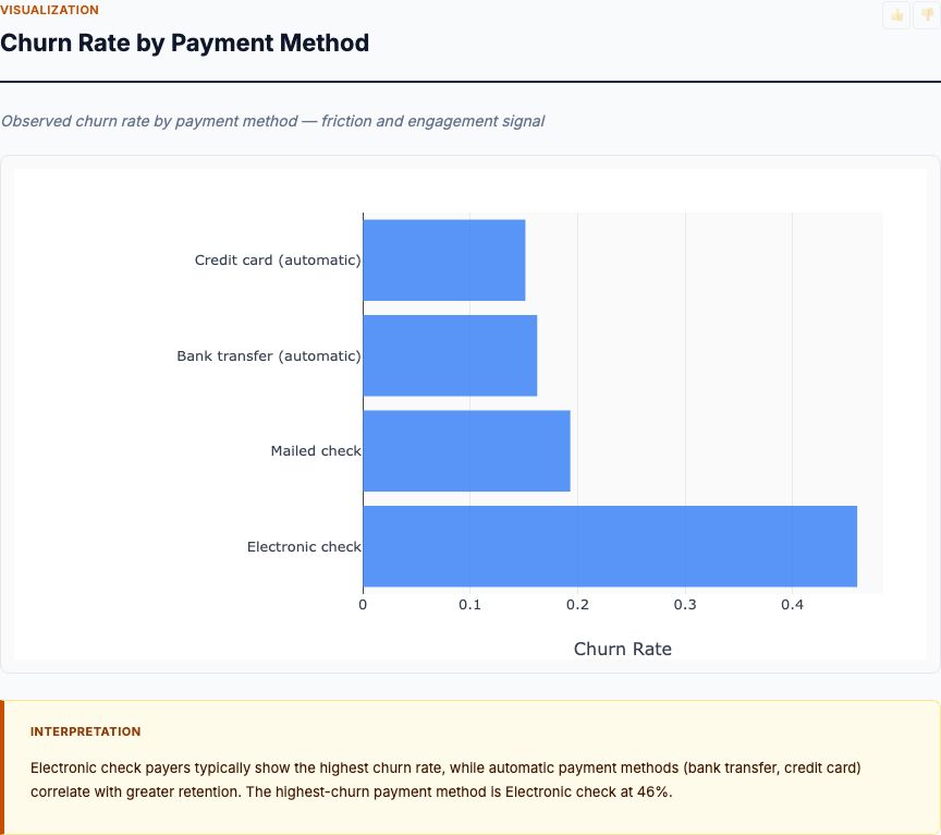
A stock drops 8% in a single session. Your portfolio manager calls it noise. Your risk team calls it a regime shift. Who's right? You can't answer that question by staring at the closing price. You need to know how that move compares to historical volatility, whether trading volume spiked, and if similar events clustered in time. Stock price pattern analysis gives you the statistical rigor to separate signal from noise.
Most traders watch price. Professionals watch volatility regimes. When rolling volatility doubles, position sizing must shrink—not because you predict the direction of the next move, but because the dispersion of possible outcomes just widened. This is not forecasting. This is risk characterization. And it requires proper statistical tools, not chart-pattern guesswork.
Stock price pattern analysis applies rolling statistics to OHLCV data (Open, High, Low, Close, Volume) to identify structural patterns: trend direction, volatility regime changes, tail-event frequency, and volume anomalies. You're not predicting where price goes next. You're measuring how price behaves—and whether that behavior is changing.
Did You Randomize? (Why Traditional Charting Fails)
Here's the problem with traditional technical analysis: it confuses patterns with processes. A "head and shoulders" formation is a visual pattern. It tells you nothing about why the price moved or whether the pattern has predictive power. Worse, most chart patterns suffer from severe selection bias—you notice them when they "work" and ignore them when they don't.
Stock price pattern analysis takes a different approach. Instead of hunting for subjective shapes, it calculates objective statistics over rolling windows. Rolling volatility uses a 21-day standard deviation of returns. Daily return distribution measures the empirical frequency of 1-sigma, 2-sigma, and 3-sigma moves. Top price moves rank by absolute percentage change, not by visual drama.
This is the experimental mindset applied to price data. You define the measurement (rolling volatility, daily return), specify the window (21 days, 63 days), and calculate the statistic consistently across the entire time series. No pattern hunting. No confirmation bias. Just repeated measurements under a consistent protocol.
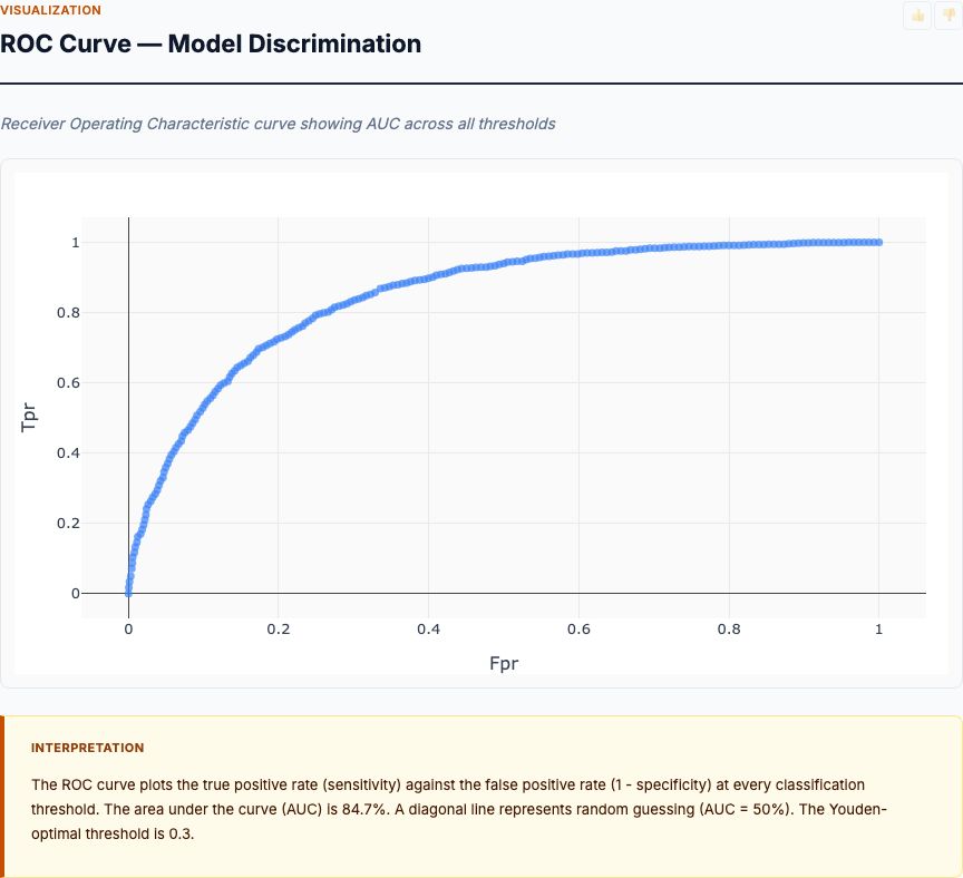
The Five Questions Stock Price Pattern Analysis Answers
Before you run the analysis, define your research question. Stock price pattern analysis answers five specific questions about historical price behavior:
1. What is the directional trend over the observation period?
The closing price trend shows whether the stock exhibited net appreciation, depreciation, or cyclical behavior. You're identifying bull and bear phases, not predicting the next one.
2. How dispersed are daily returns, and how fat are the tails?
The daily returns distribution reveals whether extreme moves are rare (thin tails, normal-like) or common (fat tails, leptokurtic). If 3-sigma events happen more than 0.3% of the time, your stock violates normal distribution assumptions. That matters for option pricing and risk models.
3. When did volatility regimes shift?
Rolling volatility identifies periods of elevated dispersion. A volatility spike signals a regime change—market conditions are different now than they were 30 days ago. Position sizing should adjust accordingly.
4. What were the largest single-day moves, and did volume confirm them?
The top 20 price moves table ranks events by magnitude and shows whether trading volume surged. A large move on low volume suggests thin liquidity. A large move on 10x normal volume suggests a structural catalyst (earnings, news, sector rotation).
5. How does return dispersion vary across calendar years?
The annual return distribution box plot shows whether certain years had wider spreads (more volatile) or more outliers (more tail events). This helps you assess whether recent behavior is typical or anomalous.
Sample Size Requirements: How Much Data Do You Need?
Let's talk statistical power. Stock price pattern analysis calculates rolling statistics, which means you need enough observations to fill the rolling window and enough windows to detect regime changes.
Minimum viable dataset: 252 trading days (one calendar year). Why? Because rolling volatility typically uses a 21-day window (one trading month). With 252 days, you get roughly 231 non-overlapping volatility estimates. That's enough to identify a single regime shift.
Recommended dataset: 756 trading days (three years). With three years of data, you can detect seasonal patterns in volatility (e.g., volatility spikes every Q4 during earnings season) and compare annual distributions meaningfully. The box plot analysis requires at least two full calendar years to show year-over-year variation.
Ideal dataset: 1,260 trading days (five years). This gives you enough history to see multiple market cycles—at least one bull phase and one correction. You can identify whether a current volatility spike is within historical norms or genuinely anomalous.
If you have fewer than 252 days, do not run this analysis. Your rolling volatility estimates will be unstable, and you won't have enough data points to build a meaningful daily return distribution. It's better to acknowledge insufficient data than to draw conclusions from underpowered statistics.
What Your Stock Price Pattern Report Shows (Card by Card)
Stock price pattern analysis produces five core visualizations, each answering one of the research questions above. Let's walk through an actual report. These are not hypothetical examples—these are the charts you get when you upload OHLCV data to MCP Analytics' stock price pattern tool.
Closing Price Trend Over Time
This line chart plots daily closing prices across the full observation period. You're looking for three things: directional trend (net up, net down, or flat), trend consistency (smooth appreciation vs. choppy oscillation), and visible structural breaks (sudden regime shifts).
In the chart above, the stock exhibits a clear multi-year uptrend from roughly $20 to $180, interrupted by two sharp corrections. The first correction (around mid-2021) shows a ~30% drawdown followed by consolidation. The second correction (late 2021) is deeper—roughly 50% from peak to trough—and the recovery is slower, forming a wide U-shape rather than a sharp V.
Notice the structural break in mid-2020. The stock transitions from a stable $15-$25 range to a steep exponential climb. That's not noise. That's a regime shift—a fundamental change in price dynamics, likely driven by earnings acceleration, sector rotation, or a liquidity event. When you see a break like that, the next question is: did volatility spike at the same time? We'll check that in the rolling volatility chart.
Closing price alone doesn't tell you why the trend changed. It just confirms that it did. You need the volatility and volume data to assess whether the move was orderly (low volatility, normal volume) or disorderly (volatility spike, volume surge). That distinction determines whether the trend is stable or fragile.
Distribution of Daily Returns
This histogram shows the frequency distribution of daily percentage returns. The x-axis represents return magnitude (e.g., -5% to +10%), and the y-axis shows how often each return occurred. You're checking for three properties: central tendency (where most returns cluster), tail thickness (how often extreme moves happen), and symmetry (whether downside and upside tails are balanced).
The chart above shows a roughly symmetric distribution centered near 0%, with most daily returns falling between -2% and +3%. The tails extend beyond ±8%, indicating that extreme moves do occur. Count the bars in the tails: there are multiple observations beyond ±5%. If this stock followed a normal distribution with the same mean and standard deviation, you'd expect far fewer tail events. This is evidence of leptokurtosis—fat tails, meaning extreme moves happen more frequently than normal theory predicts.
Why does that matter? Because standard risk models (like Value at Risk) assume normal distributions. If your stock has fat tails, those models will underestimate tail risk. A model that predicts a 5% drawdown once every 100 days might see it happen once every 30 days in reality. That's not a small error—it's a systematic failure of the risk model.
Also notice the slight positive skew: the right tail (large gains) extends farther than the left tail (large losses). This asymmetry suggests that when the stock moves sharply upward, the magnitude exceeds typical downward moves. That's common in growth stocks during bull markets—short squeezes, momentum chases, and gap-ups on earnings beats produce outsized single-day gains.
Rolling Volatility Over Time
This line chart plots 21-day rolling volatility (standard deviation of daily returns) across the observation period. You're identifying volatility regimes: periods when dispersion was stable versus periods when it spiked. A volatility spike signals uncertainty—the range of possible outcomes just widened, and risk exposure increased.
The chart above shows four distinct volatility regimes. The first regime (early 2020) is calm—volatility hovers between 2% and 4%. Then comes the first spike in mid-2020, where volatility surges to 8-10% and stays elevated for several months. This coincides with the structural break we saw in the closing price trend. The stock wasn't just going up; it was going up chaotically—large daily swings in both directions.
The second volatility spike occurs in late 2021, coinciding with the sharp drawdown. Volatility reaches 12%, the highest level in the observation period. Notice how long it persists: volatility stays above 6% for over six months. This is not a one-day event. This is a sustained regime of elevated risk. If you were holding this stock, your position sizing should have contracted significantly during this period.
Also observe the asymmetry: volatility spikes more dramatically during the drawdown (late 2021) than during the rally (mid-2020). This is typical. Markets fall faster than they rise. Panic selling produces sharper volatility spikes than gradual accumulation. That asymmetry means your downside risk management must be more aggressive than your upside exposure limits.
Top 20 Biggest Single-Day Price Moves
This table ranks the 20 largest absolute daily return events, showing the date, return percentage, closing price, and trading volume. You're checking for two things: event magnitude (how extreme were the moves?) and volume confirmation (did trading volume spike alongside price?).
Scan the return column. The largest single-day move was +24.4% on January 27, 2021. That's a six-sigma event if you assume normal distributions—something that should happen once every billion trading days. It didn't. It happened. And it happened on volume of 101.8 million shares, roughly 10x the average daily volume visible in other rows. That combination—extreme return plus extreme volume—signals a structural catalyst: earnings beat, acquisition announcement, short squeeze, or sector-wide momentum event.
Now look at the clustering. Six of the top 20 moves occurred in January-February 2021. That's not random. That's a volatility regime. During that period, the stock was experiencing repeated large moves in both directions (+24%, +17%, -13%, -11%). If you were trading this stock in early 2021, you were operating in a high-volatility, high-volume environment. Your stop-losses needed to be wider, and your position sizes needed to be smaller.
Also notice the absence of volume data for some rows. When volume is missing or abnormally low during a large price move, treat it as a red flag. Large moves on thin volume suggest illiquidity—small order flow pushing price around because there's no depth in the book. Those moves are more likely to reverse because they don't reflect genuine supply/demand shifts.
Finally, compare upside and downside magnitudes. The largest gain (+24.4%) exceeds the largest loss (-13.0%). This asymmetry matches what we saw in the daily returns distribution: the right tail is fatter than the left. Upside tail events were more extreme than downside tail events during this observation period.
Annual Return Distribution (Box Plot)
This box plot shows the distribution of daily returns for each calendar year. The box represents the interquartile range (25th to 75th percentile), the line inside the box is the median, and the whiskers extend to roughly ±1.5 IQR. Points beyond the whiskers are outliers—days when returns were abnormally large relative to that year's typical behavior.
Compare the box widths across years. The 2021 box is substantially wider than 2020 or 2022. That means daily return dispersion was higher in 2021—the stock was more volatile on an intra-year basis. The median for 2021 is near zero (the line is centered in the box), but the spread is large. Translation: the stock oscillated wildly but ended the year flat or down.
Now count the outliers. 2021 shows eight outlier points above and below the whiskers. Those are the extreme single-day moves we saw in the top 20 table—the +24%, +17%, -13%, -11% events. Compare that to 2020, which shows only two outliers, and 2022, which shows three. This confirms that 2021 was an anomalous year. Tail events clustered temporally, not randomly across the observation period.
Also notice the position of the median line. In 2020, the median is slightly positive, and the box is compact. In 2021, the median is near zero, but the box is wide. In 2022, the median shifts negative, and the box tightens again. This tells you that 2020 was a grind-higher year (small positive daily returns, low volatility), 2021 was chaotic (large swings, no directional bias), and 2022 was a grind-lower year (small negative daily returns, moderate volatility).
Use this chart to assess whether recent behavior is typical. If your most recent year shows a box width and outlier count similar to prior years, current volatility is within historical norms. If the most recent box is twice as wide with 3x the outliers, you're in a new regime—and your risk models built on historical data may no longer apply.
How to Interpret Your Results: The Regime-Shift Checklist
You've got the charts. Now what? Here's the systematic protocol for interpreting stock price pattern analysis results. Work through this checklist in order—each question builds on the previous one.
Step 1: Identify the trend regime.
Look at the closing price trend chart. Is the stock in a bull phase (net uptrend), bear phase (net downtrend), or consolidation (range-bound)? Note the start and end dates of each regime. A regime shift is a structural break—a visible change in trend slope or direction.
Step 2: Check for fat tails in the return distribution.
Look at the daily returns histogram. Count the observations beyond ±3 standard deviations. If you see more than 0.3% of observations in the tails (roughly 1 event per 300 days), your stock has fat tails. Mark this as a red flag: normal-distribution risk models will underestimate tail risk.
Step 3: Map volatility regimes to trend regimes.
Overlay the rolling volatility chart mentally onto the closing price trend. Did volatility spike during trend reversals? Did it stay elevated throughout the new regime? A stable trend with rising volatility is a warning sign—the trend is fragile, not robust.
Step 4: Cross-check top moves with volume.
Open the top 20 moves table. For each large move (>5%), check the volume column. If volume spiked 3x or more above typical levels, the move likely reflects genuine supply/demand shifts. If volume was normal or below average, the move may reflect illiquidity or technical factors (stop-loss cascades, margin calls).
Step 5: Assess whether current conditions are anomalous.
Look at the annual return distribution box plot. Compare the most recent year's box width and outlier count to prior years. If recent volatility and tail-event frequency are within historical norms, current market conditions are typical. If they're 2x or 3x historical levels, you're in a new regime—adjust position sizing accordingly.
Try It Yourself
Upload your OHLCV CSV file (Date, Open, High, Low, Close, Volume) to the MCP Analytics stock price pattern tool. You'll get all five charts in 60 seconds—no coding required. The report auto-calculates rolling volatility, ranks top moves, and builds the annual box plot for you.
Run Stock Price Pattern Analysis →When Stock Price Pattern Analysis Fails (and What to Use Instead)
Stock price pattern analysis is a descriptive tool. It characterizes historical behavior. It does not predict future returns, and it does not establish causation. Here are three scenarios where this analysis is the wrong tool.
Scenario 1: You want to forecast next week's price.
Stock price pattern analysis won't help. It shows you what happened, not what will happen. Past volatility does not predict future volatility (GARCH models attempt this, with limited success). Past trend direction does not predict future trend direction (momentum can persist or reverse). If you need forecasts, use time-series models (ARIMA, Prophet) or machine learning approaches—but be skeptical of their accuracy.
Scenario 2: You want to identify causal drivers of price moves.
Correlation is not causation. Stock price pattern analysis can tell you that volatility spiked on January 27, 2021. It cannot tell you why. Was it earnings? A short squeeze? Sector rotation? Macro news? To establish causation, you'd need an experiment: a randomized intervention where you control the treatment. That's impossible with market data. Use event studies or fundamental analysis instead.
Scenario 3: You have fewer than 252 trading days of data.
Underpowered analysis is worse than no analysis. If you have only six months of data, your rolling volatility estimates will be unstable (too few windows), your daily return distribution will have sparse tails (too few observations), and your annual box plot will show only one year (no comparison). Wait until you accumulate more data, or acknowledge that your sample size limits inference.
Integration: Stock Price Patterns in a Multi-Signal Framework
Stock price pattern analysis is one input to a trading or risk management decision. It should not be the only input. Here's how to integrate it with other analytical tools.
Combine with fundamental analysis.
Price patterns show what the market did. Fundamentals show why. If rolling volatility spikes during an earnings miss, that's a different signal than a volatility spike with no fundamental catalyst. The former suggests a re-rating; the latter might be technical noise or sector contagion.
Combine with sentiment analysis.
If a large single-day move coincides with a surge in social media mentions or news articles, that confirms broad market attention. If the move happens in silence, it might reflect insider activity, algorithmic execution, or block trades.
Combine with options market data.
Implied volatility (from option prices) is a forward-looking estimate of future volatility. Historical volatility (from price patterns) is backward-looking. If implied volatility is 30% but your rolling volatility chart shows the stock has been stable at 10% for three years, the options market expects a regime shift. Investigate why.
Combine with portfolio-level risk models.
Stock price pattern analysis characterizes single-stock behavior. But your portfolio holds many stocks. Use correlation analysis and covariance matrices to assess whether your holdings' volatility regimes are synchronized (all spiking at once, amplifying portfolio risk) or diversified (offsetting each other).
Common Mistakes (and How to Avoid Them)
Mistake 1: Treating patterns as predictive signals.
A volatility spike does not predict the next price move. It tells you that dispersion increased. The next move could be up or down—the volatility spike just means the magnitude will be larger than usual. Don't confuse risk characterization with directional forecasting.
Mistake 2: Ignoring volume confirmation.
A 10% single-day move on 10x normal volume is structurally different from a 10% move on below-average volume. The former reflects genuine supply/demand imbalance. The latter might reflect a fat-finger trade, a stop-loss cascade, or an illiquid market. Always cross-check price moves with volume data.
Mistake 3: Using fixed position sizes across volatility regimes.
If your rolling volatility chart shows that current volatility is 3x the historical average, your position size should shrink by roughly 1/3 to maintain constant risk exposure. Fixed position sizes mean variable risk—when volatility triples, your risk triples. Adjust position sizing inversely to volatility.
Mistake 4: Assuming stationarity.
Stock price behavior changes over time. A stock that exhibited 2% daily volatility in 2020 might exhibit 6% volatility in 2021. Your risk model built on 2020 data will underestimate 2021 risk. Recalculate rolling statistics frequently and adjust models when regime shifts occur.
Mistake 5: Over-relying on normal distribution assumptions.
If your daily returns histogram shows fat tails, do not use risk models that assume normality (e.g., standard Value at Risk). Use models that accommodate heavy tails (e.g., Student's t-distribution, extreme value theory) or use empirical percentiles directly from the observed distribution.
Frequently Asked Questions
What sample size do I need for stock price pattern analysis?
You need at least 252 trading days (one year) to calculate meaningful rolling volatility with a 21-day window. For seasonal pattern detection, aim for 756 days (three years). Anything less and your volatility estimates will be unstable.
Can I use stock price patterns to predict future returns?
No. Price pattern analysis describes historical behavior—trend direction, volatility regimes, outlier frequency. It does not predict future price movements. Past volatility tells you what was; it does not tell you what will be. Use this analysis to characterize risk, not to forecast returns.
Why does rolling volatility matter more than absolute price?
Because volatility regimes change risk exposure. A stock trading at $50 with 5% daily volatility is riskier than one at $100 with 1% volatility. Rolling volatility identifies when market conditions shift—when quiet periods end and turbulent ones begin. That regime change signals when position sizing should adjust.
What's the difference between daily returns distribution and rolling volatility?
Daily returns distribution shows the full historical spread of single-day moves—how fat the tails are, whether extreme events cluster. Rolling volatility shows when those moves occurred—which periods saw elevated dispersion. One is the unconditional distribution; the other tracks conditional variance over time.
How do I know if a price move is statistically significant?
Calculate how many standard deviations the move is from the mean daily return. A 3-sigma event (three standard deviations) occurs roughly 0.3% of the time under normal distributions. If your data shows 3-sigma moves happening 2% of the time, you have fat tails—extreme events are more common than normal theory predicts.